AI App Station
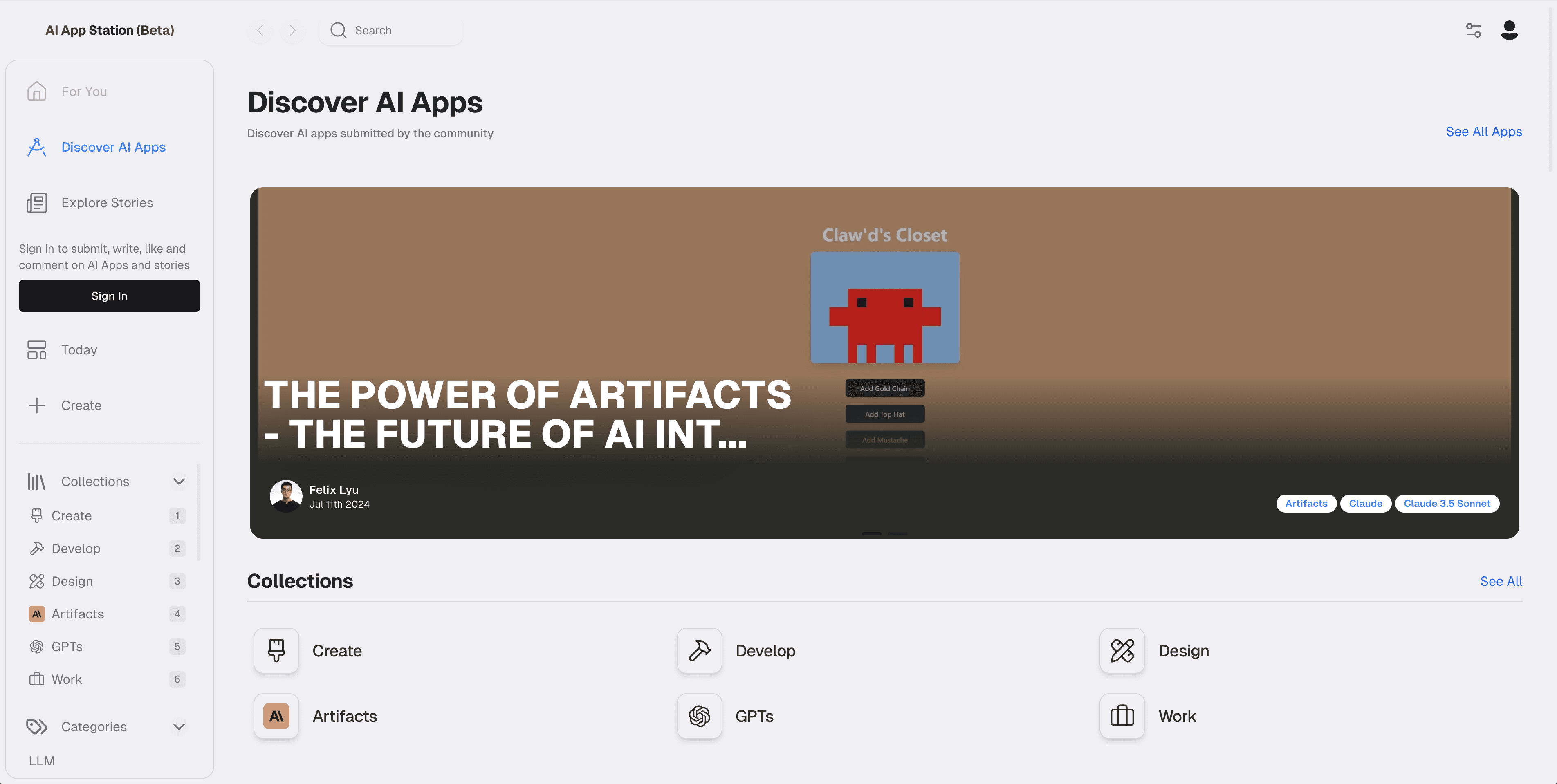
I built AI App Station independently during my freelance period. It began as a way to make AI tool discovery feel curated and useful instead of looking like another long directory.
The problem
New AI products were appearing faster than people could evaluate them. Most directories solved this by adding more listings, but a larger list did not make the choice easier.
I wanted each product to have enough context to answer a practical question: what is it, who made it, what does it feel like to use, and is it worth opening now?
Discovery over inventory
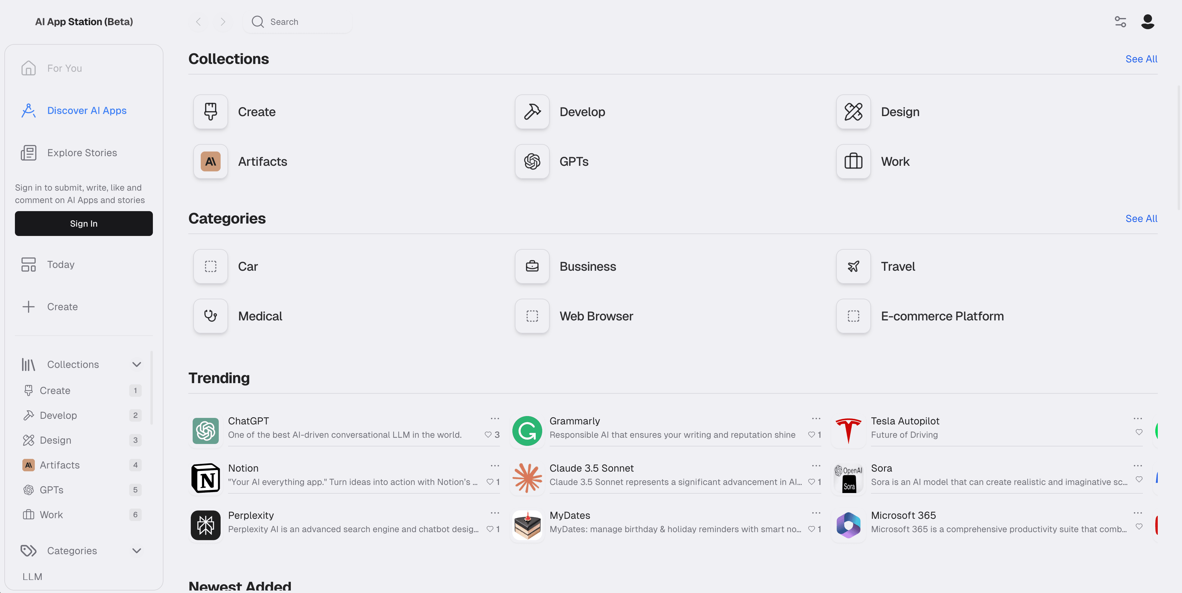
The product organizes apps through categories, collections, featured carousels, daily picks, and related products. A Today view mixes a daily app with editorial posts so discovery has a rhythm instead of feeling like a database search.
Detailed pages bring together screenshots, descriptions, pricing, developer information, reviews, comments, and a clear way to launch the product.
Community publishing
I built a submission and publishing flow for creators, including app details, screenshots, categories, pricing, developer profiles, and a richer introduction editor. Users can manage drafts and published entries from their own workspace.
Stories use a similar editorial system, with topics, previews, publishing states, and a long-form editor. That made the product useful to both people browsing and people explaining what they had built.
The full system
The project includes accounts, profiles, search, favorites, likes, comments, reviews, sharing, image storage, and role-based publishing controls. I built the product in Next.js with Supabase handling the data, authentication, and storage layer.
Working across the whole system taught me how quickly content, community, and moderation states become part of the product—not supporting features around it.
What I cared about
I wanted a dense amount of information to remain calm and browsable. The visual direction borrowed the familiarity of an app store, then added editorial surfaces so each tool could be understood in context.
Development is now paused and the repository remains available as a demo. I still see it as an important independent project because it brought product design, content systems, community features, and full-stack delivery into one place.