shadcn/ui Resizable Sidebar
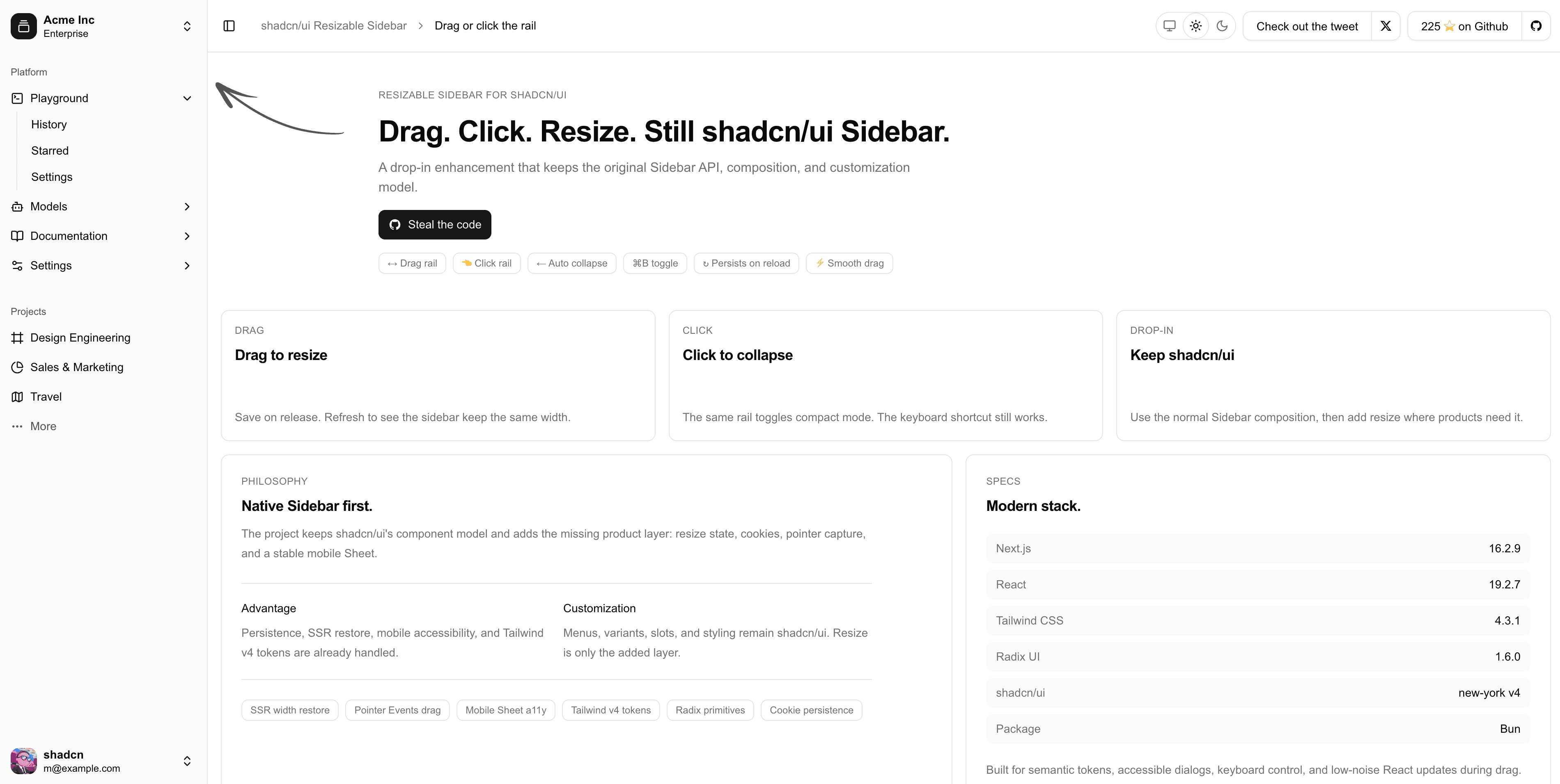
I built this component to add desktop-style resizing to shadcn/ui Sidebar without replacing the API, composition model, or customization developers already know.
The missing layer
shadcn/ui provides a flexible Sidebar, but real desktop products often need users to choose their own working width. That behavior touches more than a drag handle: collapse rules, saved state, keyboard control, server rendering, and mobile all need to agree.
Keep the original Sidebar
The component keeps the normal shadcn/ui slots, variants, menus, and styling. Resize state is an added layer, so an existing Sidebar can adopt it without being rebuilt around a new component system.
The interaction
Users can drag the rail to resize, click it to collapse, and use the existing keyboard shortcut. Dragging below a threshold collapses the Sidebar; dragging back in the other direction expands it again.
The width is saved in a cookie and restored during server rendering, which prevents the layout from jumping after hydration.

Product details
Pointer capture keeps dragging stable, mobile stays on the accessible Sheet behavior, and Tailwind tokens remain available for customization. The project reflects a simple goal: add the missing product behavior while leaving the underlying design system intact.